单细胞分析实践
编者导语
本板块是单细胞分析的实践部分:实验设计中的关键决策(测序深度、批次与混样策略)、 scanpy 的环境管理与使用原则,以及实际工作流(质控、标准化、特征选择、降维、 聚类、批次校正、可视化)。 本章与本书多数章节不同:它没有图,也没有可提取的公式与案例。 这不是编者的省略,而是源材料本身的限制——抓取到的 scanpy 与最佳实践 文档均为纯文本 Markdown,其中的插图是远程引用、未随文档保存。 编者不去拿别的图来凑数,也不假装这里有例题。 真实的流程图与结果图请直接查 scanpy 官方文档站。 scanpy 的 API 逐条参数已移入附录,不占正文。
前置:ch13、ch34。
编者注·本板块导读
图 0 张 案例 0 处 行间公式 0 个。以下清单由正文自动扫出,均为原书内容,未新增。
图:本板块正文未包含可提取的图片。scanpy 官方文档抓取到的 Markdown 里不含图片,这是源材料本身的限制,不是编者遗漏。
案例:本板块以方法与算法推导为主,原书未给出可提取的例题。
公式:本板块不涉及需要推导的数学表达式。
本板块由以下原始章节合并而成:ch46。
Prior art
Single-cell analysis has evolved from a niche area of interest into a well-established field of study. As a result, we are certainly not the first to produce a book on this subject, nor to provide guides and tutorials. In the sections that follow, we review two notable and ongoing initiatives aimed at teaching single-cell analysis, highlighting both their similarities to and differences from this book.
Bioconductor OSCA and OSTA books 
Orchestrating Single-Cell Analysis with Bioconductor (Bioconductor OSCA) Amezquita et al., 2022, available online at https:// bioconductor.org/books/release/OSCA/, is an online book designed to teach common workflows for analyzing of single-cell RNA- Sequencing (scRNA-seq) data using the R based Bioconductor ecosystem Huber et al., 2015. An accompanying paper with the same title Amezquita et al., 2020 provides an overview of single-cell analysis with Bioconductor, while the online book offers more in-depth coverage, featuring detailed explanations and extensive code examples.
The OSCA book is highly comprehensive in its treatment of basic scRNA-seq analysis, offering clear explanations and detailed workflow examples. However, it does not extend to other single-cell omics, such as single-cell ATAC-seq (scATAC-seq). Spatial transcriptomics is addressed separately in the complementary book Orchestrating Spatially-Resolved Transcriptomics Analysis with Bioconductor (Bioconductor OSTA), available at https:// lmweber.org/OSTA-book/.
As both books are tailored to the Bioconductor ecosystem, they exclusively use tools available within Bioconductor. While these tools are highly effective, they may not always provide the most optimal solution for every analysis, as acknowledged by the books themselves. Overall, the Bioconductor books are particularly well-suited for individuals with a foundational knowledge of R and a strong background in biology who wish to learn how to analyze single-cell and spatial transcriptomics data within the Bioconductor framework.
Current best practices in single-cell RNA-seq analysis: a tutorial 
Current Best Practices in Single-Cell RNA-Seq Analysis: A Tutorial Luecken & Theis, 2019 by Malte Lücken and Fabian Theis introduces best practices for scRNA-seq analysis. Its key contribution lies in not only reviewing potential analysis steps but also recommending best practices based on independent benchmarks. When specific best-practice guidelines are unavailable, the authors provide general recommendations for analysis approaches. The fundamental idea of focusing on independent benchmarks inspired our work substantially. The paper is complemented by an example analysis of mouse intestinal epithelium regions from Haber et al. Haber et al., 2017.
In comparison to Bioconductor OSCA, this paper and its associated analysis are not constrained by a specific tool ecosystem, offering a broader perspective on the range of topics covered. However, the accompanying example analysis lacks beginner-friendliness and has become outdated. Analogously to Bioconductor OSCA, Lücken & Theis do not address newer developments such as RNA velocity, spatial transcriptomics, or multi-omics.
Despite these limitations, we highly recommend this paper as a valuable introduction to the field and as a guide to initial best practices in scRNA-seq analysis. The chapters in this book build on the latest best practices, offering an updated perspective on the field. Furthermore, the workflows in this book are explained in greater detail, providing readers with the background information necessary to effectively apply the methods. We advise against relying on the example case study provided with the paper and instead encourage readers to explore the detailed chapters in this book for a more comprehensive and up to date understanding.
References
- Amezquita, R., Lun, A., Hicks, S., & Raphael, G. (2022). Orchestrating Single-Cell Analysis with Bioconductor . https://bioconductor.org/books/release/OSCA/
- Huber, W., Carey, V. J., Gentleman, R., Anders, S., Carlson, M., Carvalho, B. S., Bravo, H. C., Davis, S., Gatto, L., Girke, T., Gottardo, R., Hahne, F., Hansen, K. D., Irizarry, R. A., Lawrence, M., Love, M. I., MacDonald, J., Obenchain, V., Oleś, A. K., … Morgan, M. (2015). Orchestrating high-throughput genomic analysis with Bioconductor. Nature Methods , 12 (2), 115–121. 10.1038/nmeth.3252
- Amezquita, R. A., Lun, A. T. L., Becht, E., Carey, V. J., Carpp, L. N., Geistlinger, L., Marini, F., Rue-Albrecht, K., Risso, D., Soneson, C., Waldron, L., Pagès, H., Smith, M. L., Huber, W., Morgan, M., Gottardo, R., & Hicks, S. C. (2020). Orchestrating single-cell analysis with Bioconductor. Nature Methods , 17 (2), 137–145. 10.1038/s41592-019-0654-x
- Luecken, M. D., & Theis, F. J. (2019). Current best practices in single-cell term
RNA-seq analysis: a tutorial. Molecular Systems Biology , 15 (6), e8746. https://doi.org/10.15252/msb.20188746 - Haber, A. L., Biton, M., Rogel, N., Herbst, R. H., Shekhar, K., Smillie, C., Burgin, G., Delorey, T. M., Howitt, M. R., Katz, Y., Tirosh, I., Beyaz, S., Dionne, D., Zhang, M., Raychowdhury, R., Garrett, W. S., Rozenblatt-Rosen, O., Shi, H. N., Yilmaz, O., … Regev, A. (2017). A single-cell survey of the small intestinal epithelium. Nature , 551 (7680), 333–339. 10.1038/nature24489
Installation
Contents
Installation
To use scanpy from another project, install it using your favourite environment manager:
Adding scanpy[leiden] to your dependencies is enough. See below for how to use Scanpy’s Development Version.
If you prefer to exclusively use pip run:
1 | $ pip install 'scanpy[leiden]' |
After installing installing e.g. Miniconda, run:
1 | $ conda install -c conda-forge scanpy python-igraph leidenalg |
Pull Scanpy from PyPI:
1 | $ pip install scanpy |
If you use Hatch or pip, the extra [leiden] installs two packages that are needed for popular parts of scanpy but aren’t requirements: igraph[Csárdi and Nepusz, 2006] and leiden[Traag et al., 2019]. If you use conda, you should to add these dependencies to your environment individually.
Development Version
To work with the latest version on GitHub: clone the repository and cd into its root directory.
1 | $ gh repo clone scverse/scanpy |
To use one of the predefined Hatch environments in hatch.toml , run either hatch test [args] or hatch run [env:]command [...args] , e.g.:
1 | $ hatch test -p # run tests in parallel |
If you are using pip>=21.3 , an editable install can be made:
1 | $ python -m venv .venv |
If you want to let conda handle the installations of dependencies, do:
1 | $ pipx install beni |
For instructions on how to work with the code, see the contribution guide.
GPU acceleration
If you have a GPU, consider rapids-singlecell, which mirrors the scanpy API with order-of-magnitude speedups. See its documentation for installation and usage instructions.
Docker
If you’re using Docker, you can use e.g. the image gcfntnu/scanpy from Docker Hub.
Troubleshooting
If you get a Permission denied error, never use sudo pip . Instead, use virtual environments or:
1 | $ pip install --user scanpy |
Usage Principles
Contents
Usage Principles
Import Scanpy as:
1 | import scanpy as sc |
Workflow
The typical workflow consists of subsequent calls of data analysis tools in sc.tl , e.g.:
1 | sc.tl.umap(adata, **tool_params) # embed a neighborhood graph of the data using UMAP |
where adata is an AnnData object. Each of these calls adds annotation to an expression matrix X, which stores n_obs observations (cells) of n_vars variables (genes). For each tool, there typically is an associated plotting function in sc.pl :
1 | sc.pl.umap(adata, **plotting_params) |
If you pass show=False , a Axes instance is returned and you have all of matplotlib’s detailed configuration possibilities.
To facilitate writing memory-efficient pipelines, by default, Scanpy tools operate inplace on adata and return None – this also allows to easily transition to out-of-memory pipelines. If you want to return a copy of the AnnData object and leave the passed adata unchanged, pass copy=True or inplace=False .
AnnData
Scanpy is based on anndata , which provides the AnnData class.

At the most basic level, an AnnData object adata stores a data matrix adata.X , annotation of observations adata.obs and variables adata.var as pd.DataFrame and unstructured annotation adata.uns as dict . Names of observations and variables can be accessed via adata.obs_names and adata.var_names , respectively. AnnData objects can be sliced like dataframes, for example, adata_subset = adata[:, list_of_gene_names] . For more, see this blog post.
To read a data file to an AnnData object, call:
1 | adata = sc.read_h5ad(filename). # or sc.read_zarr(filename) |
to initialize an AnnData object. Possibly add further annotation using, e.g., pd.read_csv :
1 | import pandas as pd |
To write, use:
1 | adata.write_h5ad(filename) |
How to
How to
This section contains short examples on how to perform specific tasks with scanpy.
Cell-Cycle Scoring and Regression
Cell-Cycle Scoring and Regression
This is a Scanpy demo that shows how to regress cell cycle effect, following the approach showed in Seurat’s vignette. As for the R example, toy dataset consists of murine hematopoietic progenitors from Nestorowa et al., Blood 2016. The files of the Seurat tutorial – used here for reasons of benchmarking – can be downloaded here. A more recent version of the dataset can be downloaded here.
1 | from __future__ import annotations |
| Package | Version |
|---|---|
| pooch | 1.8.2 (v1.8.2) |
| scanpy | 1.11.4 |
| Component | Info |
| Python | 3.13.7 (main, Aug 15 2025, 12:34:02) [GCC 15.2.1 20250813] |
| OS | Linux-6.16.8-zen1-1-zen-x86_64-with-glibc2.42 |
| CPU | 16 logical CPU cores |
| GPU | No GPU found |
| Updated | 2025-09-22 08:42 |
| Dependency | Version |
|---|---|
| toolz | 1.0.0 |
| cloudpickle | 3.1.1 |
| Jinja2 | 3.1.6 |
| sphinxcontrib-applehelp | 2.0.0 |
| pyparsing | 3.2.5 |
| debugpy | 1.8.17 |
| ipython | 9.5.0 |
| sphinxcontrib-htmlhelp | 2.1.0 |
| parso | 0.8.5 |
| legacy-api-wrap | 1.4.1 |
| decorator | 5.2.1 |
| Pygments | 2.19.2 |
| matplotlib | 3.10.6 |
| cycler | 0.12.1 |
| pytz | 2025.2 |
| numpy | 2.3.3 |
| platformdirs | 4.4.0 |
| comm | 0.2.3 |
| jedi | 0.19.2 |
| PyYAML | 6.0.2 |
| python-dateutil | 2.9.0.post0 |
| sphinxcontrib-jsmath | 1.0.1 |
| six | 1.17.0 |
| llvmlite | 0.45.0 |
| numba | 0.62.0 |
| threadpoolctl | 3.6.0 |
| joblib | 1.5.2 |
| scipy | 1.16.2 |
| ipykernel | 6.30.1 |
| dask | 2025.9.1 |
| stack-data | 0.6.3 |
| MarkupSafe | 3.0.2 |
| jupyter_core | 5.8.1 |
| natsort | 8.4.0 |
| texttable | 1.7.0 |
| h5py | 3.14.0 |
| pyzmq | 27.1.0 |
| tblib | 3.1.0 |
| sphinxcontrib-devhelp | 2.0.0 |
| pandas | 2.3.2 |
| traitlets | 5.14.3 |
| packaging | 25.0 |
| anndata | 0.11.3 |
| tornado | 6.5.2 |
| pure_eval | 0.2.3 |
| sphinxcontrib-serializinghtml | 2.0.0 |
| sphinxcontrib-qthelp | 2.0.0 |
| asttokens | 3.0.0 |
| kiwisolver | 1.4.9 |
| tqdm | 4.67.1 |
| executing | 2.2.1 |
| psutil | 7.1.0 |
| pillow | 11.3.0 |
| charset-normalizer | 3.4.3 |
| wcwidth | 0.2.13 |
| igraph | 0.11.9 |
| scikit-learn | 1.7.2 |
| session-info2 | 0.2.2 |
| prompt_toolkit | 3.0.52 |
| leidenalg | 0.10.2 |
| jupyter_client | 8.6.3 |
Load data
1 | p_zip = pooch.retrieve( |
Load cell cycle genes defined in Tirosh et al, 2015. It is a list of 97 genes, represented by their gene symbol. The list here is for humans, in case of alternate organism, a list of ortologues should be compiled. There are major differences in the way Scanpy and Seurat manage data, in particular we need to filter out cell cycle genes that are not present in our dataset to avoid errors.
1 | with zipfile.ZipFile(p_zip, "r") as f_zip: |
Here we define two lists, genes associated to the S phase and genes associated to the G2M phase
1 | s_genes = [x for x in cell_cycle_genes[:43] if x in adata.var_names] |
Standard filters applied. Note that we do not extract variable genes and work on the whole dataset, instead. This is because, for this demo, almost 70 cell cycle genes would not be scored as variable. Cell cycle scoring on ~20 genes is ineffective.
1 | sc.pp.filter_cells(adata, min_genes=200) |
Log-transformation of data and scaling should always be performed before scoring
1 | sc.pp.log1p(adata) |
We here perform cell cycle scoring. The function is actually a wrapper to scanpy.tl.score_genes() , which is launched twice, to score separately S and G2M phases. Both scanpy.tl.score_genes() and scanpy.tl.score_genes_cell_cycle() are a port from Seurat and are supposed to work in a very similar way. To score a gene list, the algorithm calculates the difference of mean expression of the given list and the mean expression of reference genes. To build the reference, the function randomly chooses a bunch of genes matching the distribution of the expression of the given list. Cell cycle scoring adds three slots in data, a score for S phase, a score for G2M phase and the predicted cell cycle phase.
1 | sc.tl.score_genes_cell_cycle(adata, s_genes=s_genes, g2m_genes=g2m_genes) |
Here comes another difference from Seurat. The R package stores raw data, scaled data and variable genes information in separate slots, Scanpy instead keeps only one snapshot of the data. This implies that PCA is always calculated on the entire dataset. In order to calculate PCA reduction using only a subset of genes (like cell_cycle_genes ), a trick should be used. Basically we create a dummy object to store information of PCA projection, which is then reincorporated into original dataset.
1 | adata_cc_genes = adata[:, cell_cycle_genes].copy() |
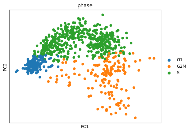
As in the original vignette, cells can be easily separated by their cell cycle status when cell cycle genes are used. Now we can regress out both S score and G2M score.
1 | sc.pp.regress_out(adata, ["S_score", "G2M_score"]) |
Finally, we reproject dataset using cell cycle genes again. Since we regressed the scores, no effect of cell cycle is now evident.
1 | adata_cc_genes = adata[:, cell_cycle_genes].copy() |
Using other kNN libraries in Scanpy
Using other kNN libraries in Scanpy
Since Scanpy was released, there has been quite some development in the space of approximate nearest neighbor detection.
In our example, we’re going to use Annoy:
1 | from __future__ import annotations |
1 | Note: you may need to restart the kernel to use updated packages. |
1 | import scanpy as sc |
1 | scanpy==1.10.0rc2.dev0+g48b495d9.d20240222 anndata==0.10.5.post1 umap==0.5.5 numpy==1.26.4 scipy==1.12.0 pandas==2.2.0 scikit-learn==1.4.1.post1 statsmodels==0.14.1 igraph==0.11.4 pynndescent==0.5.11 |
Our nearest neighbors implementation uses the PCA embedding by default, so let’s pre-compute that:
1 | adata_default = sc.datasets.paul15() |
1 | WARNING: In Scanpy 0.*, this returned logarithmized data. Now it returns non-logarithmized data. |
The best way to use a third-party approximate nearest neighbors implementation is to use sklearn-ann . It provides kNN Transformer classes wrapping several popular approximate nearest neighbor libraries.
Explicitly setting the transformer parameter allows customizing how this function behaves.
By default, for small datasets, Scanpy just calculates all distances. Setting the transformer parameter to "pynndescent" makes Scanpy always use its default for large datasets.
1 | %timeit sc.pp.neighbors(adata_default, n_neighbors=15) |
1 | 29.3 ms ± 1.53 ms per loop (mean ± std. dev. of 7 runs, 1 loop each) |
Looks like Annoy is quite a bit faster than PyNNDescent (but of course not as fast as Scanpy’s brute-force shortcut on a small dataset like this).
Let’s see if Leidenalg and UMAP get reasonable results when using each of the kNN graphs.
1 | for adata in [adata_default, adata_annoy, adata_pynnd]: |
1 | import matplotlib.pyplot as plt |
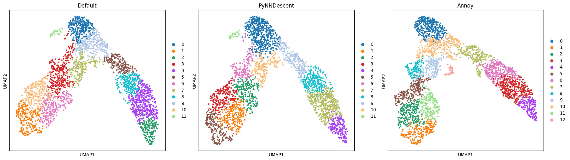
The results look sensible enough. Both embedding and community detection show some differences but are qualitatively the same:
The more narrow branch is divided into clusters length-wise, the wider one also horizontally, and the small subpopulation is detected by both community detection and embedding.
This indicates that the underlying graph is similar enough to capture these features of the dataset.
Plotting with Marsilea
Contents
Plotting with Marsilea
Marsilea is a visualization library that allows user to create composable visualization in a declarative way.
You can use it to create many scanpy plots with easy customization.
Let’s first load the PBMC datdaset
1 | from __future__ import annotations |
1 | AnnData object with n_obs × n_vars = 2638 × 13714 |
Define the cells and markers that we want to draw
1 | cell_markers = { |
Import Marsilea
1 | import marsilea as ma |
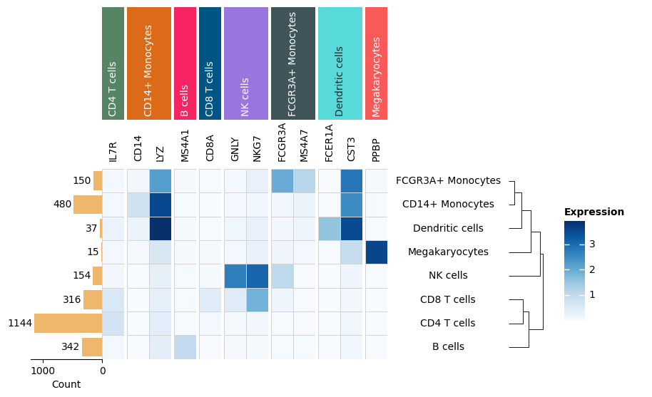
Heatmap
Here is the minimum example to create a heatmap with Marsilea, it does nothing besides create a heatmap. You can adjust the main plot size by setting height and width , the unit is inches.
We will start adding components to this main plot step by step.
1 | exp = pbmc[:, markers].X.toarray() |
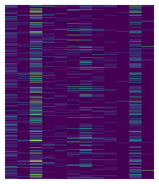
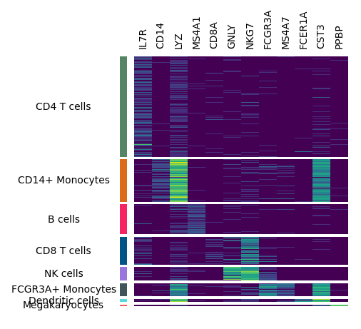
To replicate the scanpy heatmap, we can first divide the heatmap by cell types.
The group_rows method can group heatmap by group labels, the first argument is used to label the row, the order defines the display order of each cell type from top to bottom.
1 | m.group_rows(pbmc.obs["louvain"], order=uni_cells) |
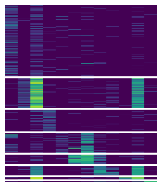
Now we can label each chunks with cell types and the columns with marker names.
You can use add_left or add_* to add a plotter to anyside of your main plot. In Marsilea, a plot instance is called plotter.
When you add a plotter, you can easily adjust its size and the padding between adjcent plot using size and pad .
1 | # Create plotters |
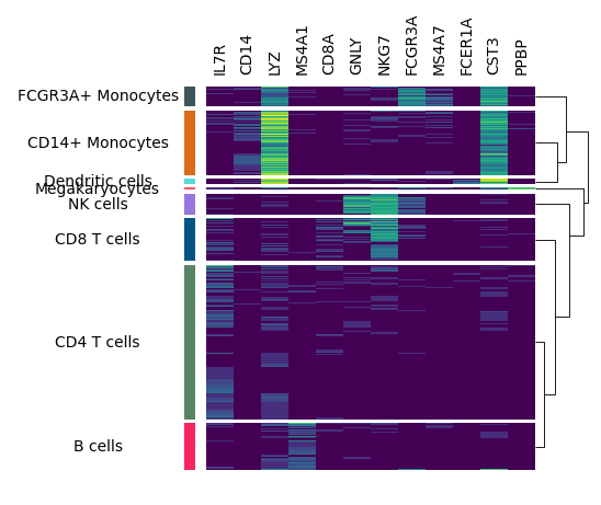
You may want to add dendrogram to display the similarity among cell types.
You can use add_dendrogram , we will add it to the right side, but you can also add it to the left side if you want.
1 | m.add_dendrogram("right", add_base=False) |
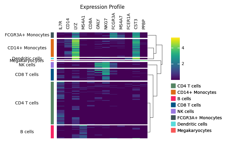
The legend is still mising, you can use add_legends to add all legends at once. Marsilea will automatically layout all the legends.
In the end, you can you add_title to add a title.
1 | m.add_legends() |
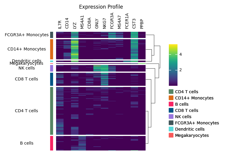
OK, let’s wrap up all the code in below. There are few things you should notice in Marsilea:
- Always call
render()in the end to actually render the plot. - The order of
add_*operation decides the order of plotters. Butgroup_rowsandgroup_colscan be called anytime.
1 | m = ma.Heatmap(exp, cmap="viridis", height=4, width=3) |
Now that we’ve covered some basics of Marsilea, we’ll see how it can be used to create custom plots similar to scanpy ’s existing methods:
1 | agg = sc.get.aggregate(pbmc[:, markers], by="louvain", func=["mean", "count_nonzero"]) |
1 | AnnData object with n_obs × n_vars = 8 × 12 |
1 | agg_exp = agg.layers["mean"] |
Matrixplot
1 | h, w = agg_exp.shape |
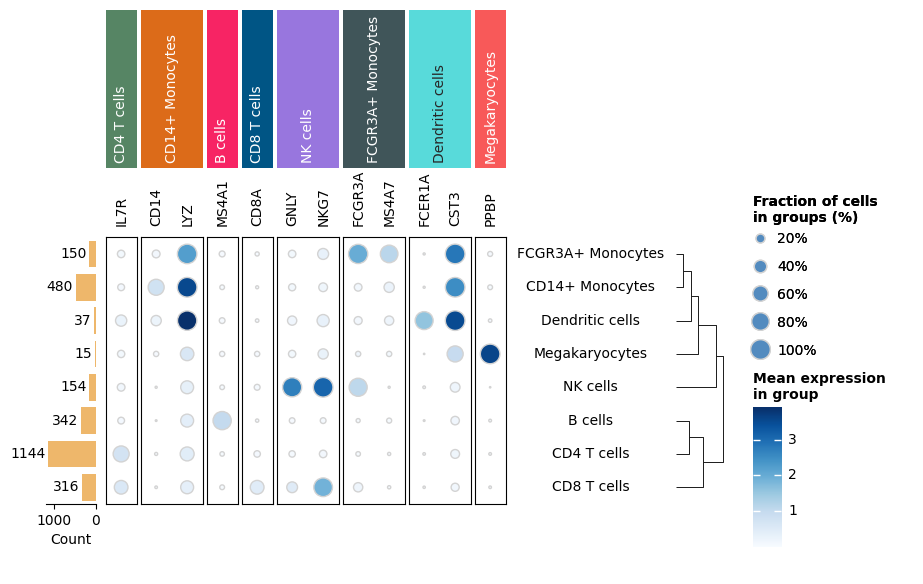
Dot plot
1 | size = agg_count / agg_cell_counts[:, np.newaxis] |
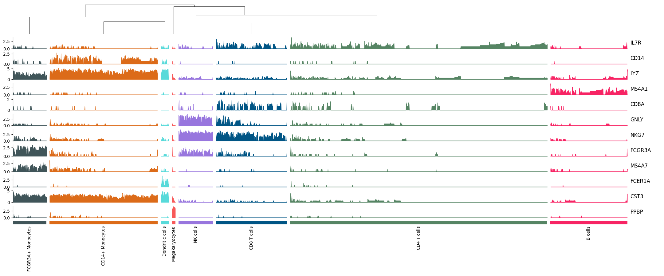
Tracksplot
1 | tp = ma.ZeroHeightCluster(exp.T, width=20) |
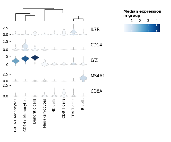
Stacked Violin
1 | import pandas as pd |
More information
Other plots are possible with Marsilea by creating new plotter. See Marsilea’s documention to learn how.
1 | import session_info |
Tutorials
Contents
Tutorials
See also
For more tutorials featuring scanpy and other scverse ecosystem tools, check out the curated set of tutorials at scverse.org/learn
Basic workflows
- Basics
- Preprocessing and clustering
- Preprocessing and clustering 3k PBMCs (legacy workflow)
- Integrating data using ingest and BBKNN
Visualization
- Plotting
- Core plotting functions
- Customizing Scanpy plots
Trajectory inference
See also
For more powerful tools for analysing single cell dynamics, check out the scverse ecosystem packages:
CellRank
Dynamo
Trajectories
- Trajectory inference for hematopoiesis in mouse
Experimental
- Experimental
- How to preprocess UMI count data with analytic Pearson residuals
- Using
daskwith Scanpy
Older tutorials
A number of older tutorials can be found at:
- The
scanpy_usagerepository
See also
Scanpy used to have tutorials for its (now deprecated) spatial data functionality. For up-to-date tutorials on working with spatial data, see:
- SquidPy Tutorials
- SpatialData tutorials
- Scverse ecosystem spatial tutorials